Stacked Area Horizontal Chart
Description
This document describes a list of attributes available to configure stacked horizontal charts. A stacked chart is a bar chart in which each bar represents a whole, and the segments of the bar represent the parts of the whole. The segments are stacked on top of each other, so the total height of the bar represents the whole.
Config Details
Preset Configuration

The preset configuration area is a common configuration for all visualizations. In this section the basic preset information can be filled such as the title and description for the wrapper configuration and the name and description for the preset itself.
| Ref No | Name | Description | Value | Recommended | Required |
|---|---|---|---|---|---|
| 1 | Preset | Defines which preset is currently selected. | Select option | - | Yes |
| 2 | Title | Defines the title of the wrapper configuration area. | No | ||
| 3 | Description | Defines the description of the wrapper configuration area. | Text Input | - | No |
| 4 | View Name | Defines the name for the view. The same name will be used for the preset. | Text Input | - | No |
| 5 | View Description | Defines the description for the view. | Text Input | - | No |
| 6 | Is Primary | Whether the preset is the default. | True, False | - | Yes |
Component Configuration
| Ref No | Name | Description | Value | Recommended | Required |
|---|---|---|---|---|---|
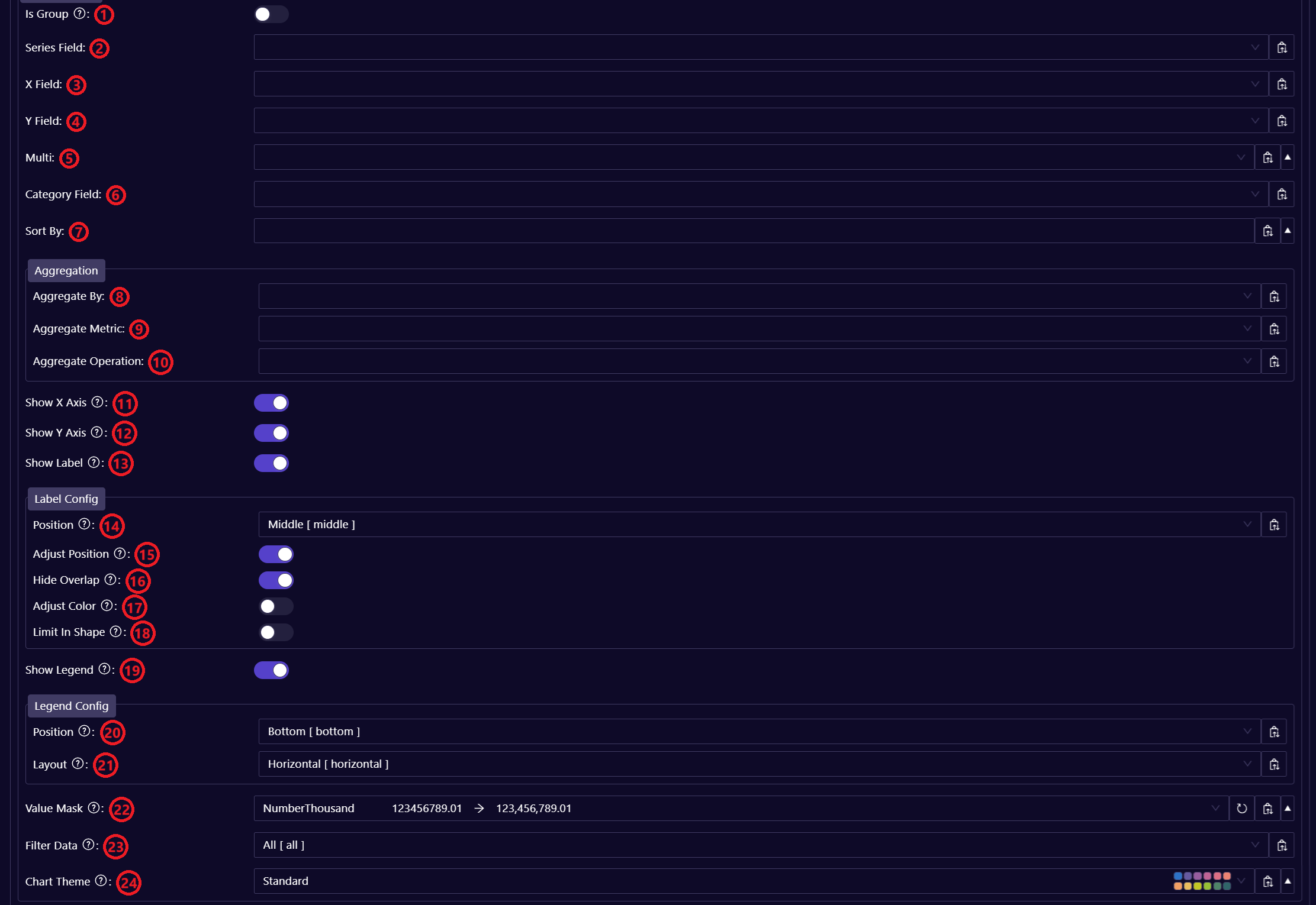
| 1 | Is Group | Whether to group the data under the same series value. | True, False | - | No |
| 2 | Series Field | Groups the data points into separate series. | Select option | - | Yes |
| 3 | X Field | Defines the data field to be used to show the dimension values of the lines that will be rendered in the chart's X axis. | Select option | - | Yes |
| 4 | Y Field | Defines the data field to be used to show the metric values of the lines that will be rendered in the chart's Y axis. | Select option | - | Yes |
| 5 | Multi | This option creates multiple instances of the chart based on a selected dimension, displaying separate charts for each value within that dimension. For example, if a time or period dimension is chosen, it will generate one chart for each time period, showing data breakdowns for the selected metric or category. This allows for easy comparison across multiple dimensions. Each value can be followed by the sorting order (separated by an empty space). The sorting order can be asc (ascending order) or desc (descending order) - e.g. "business_unit desc". If no sorting order is specified then it will be sorted in ascending order by default. | Array of selected options | - | No |
| 6 | Category Field | This option is used when the data within the main series is further divided by an additional dimension. It identifies the dimension responsible for this sub-division, effectively acting as a second-level series. The Category Field is particularly useful for visualizing details that split the data but does not directly alter the chart's structure. For example, if the chart is grouped by "Business Unit" but further split by "Sales Region" or a combination like "Sales Region, Segment" the Category Field helps identify and differentiate these splits within the series. It can be an array of multiple values. | Array of selected options | - | No |
| 7 | Sort By | Defines the data field that will be used to sort the data. It can be an array of multiple values. Each value can be followed by the sorting order (separated by an empty space). The sorting order can be asc (ascending order) or desc (descending order) - e.g. "business_unit desc". If no sorting order is specified then it will be sorted in ascending order by default. | Array of selected options | - | No |
| 8 | Aggregate By | Defines the data field(s) that will be used to aggregate the data when the data has multiple dimension fields. It can be an array of multiple values. | Array of selected options | - | No |
| 9 | Aggregate Metric | Defines the data value field that will be used when the data is being aggregated. | Select option | - | No |
| 10 | Aggregate Operation | Defines the type of operation used in the aggregation. | Sum, Average, Count, Standard Deviation | - | No |
| 11 | Show X Axis | Whether to render the X axis reference line and values. | True, False | - | No |
| 12 | Show Y Axis | Whether to render the Y axis reference line and values. | True, False | - | No |
| 13 | Show Label | Whether to render the value label. | True, False | - | No |
| 14 | Position | Defines the label position in the chart elements. | Left, Middle, Right | - | No |
| 15 | Adjust Position | Whether to automatically adjust the chart data label position. | True, False | - | No |
| 16 | Hide Overlap | Whether to prevent label overlapping. | True, False | - | No |
| 17 | Adjust Color | Whether to automatically define label text color based on color contrast with the background color. | True, False | - | No |
| 18 | Limit In Shape | Whether the label should only be shown if the chart element is wide enough. | True, False | - | No |
| 19 | Show Legend | Whether the chart legend should be rendered. | True, False | - | No |
| 20 | Position | Defines the position of the legend. | Top, Bottom, Left, Right | - | No |
| 21 | Layout | Defines the legend orientation in the chart. | Horizontal, Vertical | - | No |
| 22 | Value Mask | Defines the mask to be applied to the metric field's value. If no value is specified then the NumberThousand mask will be applied by default. | NumberThousand, ThousandNoDigits, NumberFormatted, NumberOneDigit, NumberNoDigits, NumberTwoDigits, CurrencyThousand, CurrencyFormatted, CurrencyOneDigit, CurrencyTwoDigits, PercentileTwoDigits, PercentileNoDigits, PercentileOneDigit | - | No |
| 23 | Filter Data | Filters the data to only show positive or negative values or all values. If no value is specified then all values will be shown by default. | All, Positive, Negative | - | No |
| 24 | Chart Theme | Defines the visual theme and style applied to the chart. If no value is specified then the Standard theme will be applied by default. | Standard, Divergent, Single Hue | - | No |